


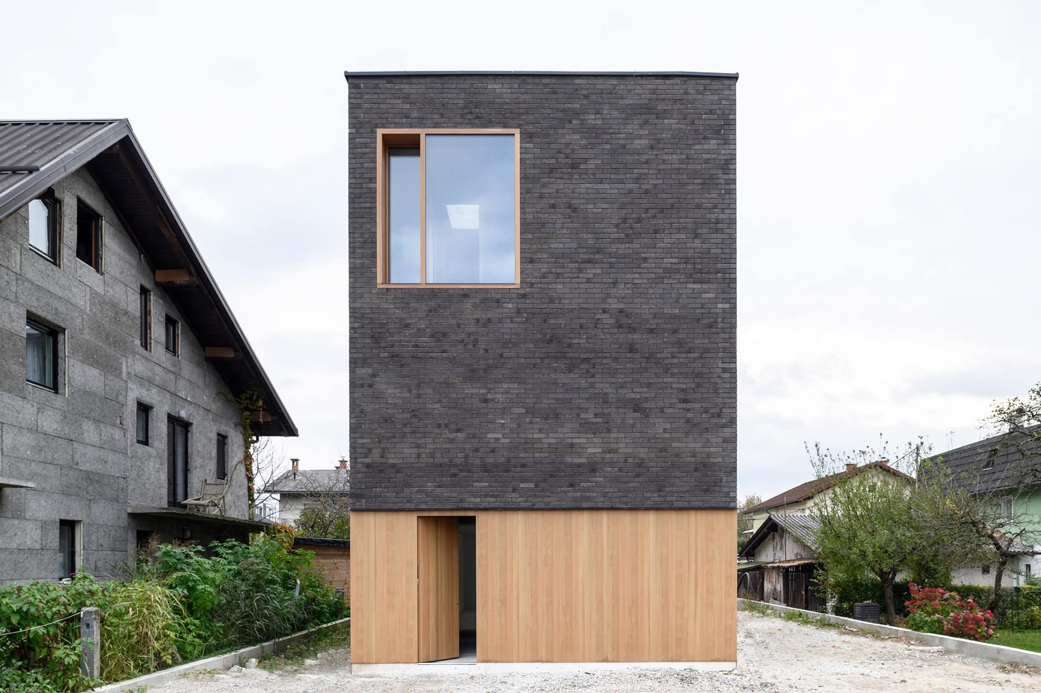
It's not farmhouse grey, it's asylum grey
We have to talk about the grey box.

Dear house flippers, beauty-hating architects, cheapskate landlords, airbnbust hosts, commitmentphobes, athleisure activists, and would-be designers, please keep your Millennial Grey to yourself.
Maybe it's because the sparkle of winter gives way to a long grey period before spring springs here in Eastern Canada. Today grey is bugging me - the colour, the shape, the feeling.
"Greige". "Agreeable grey." "The grey period." It's what happens a couple years before the divorce but after the woman gives up on trying to talk to the man about colours and she quietly convinces herself it will at least make the place easier to sell in the split.
Color is often represented as feminine, or infantile, rather than grown-up and philosophical and serious … and it’s clearly indexed to issues of race, culture, class and gender.
Design mags call it ‘international Airbnb style”. It’s a dispiriting, uninspired way to make an Instagram grid look curated. Look, if you want to match a grey couch with grey walls and grey floors because you think “it hides dirt” go ahead… though that’s wrong too, if it hides any dust and dirt it’s because it’s the colour of dust and dirt… but please paint yer box, er… housing unit.
There is nothing "neutral" about grey. Color psychology presents grey as the color of bleakness, depression, loneliness, conformity, boredom, indifference, uncertainty, sadness, fear, and contempt. Manliness compressed and confined to oblivion.
At best it's the color of diplomacy. At worst... it's a grey area. Maybe the only way to make it worse is to combine it with the colour of raw pressure-treated lumber - the saddest, probably most carcinogenic thing to ever happen to wood.
And you know that “pop of colour” you keep talking about is not going to fix anything.
It's ironic that the same Millennial demographic that will spend millions of dollars colouring their grey hair will pay even more millions to live in what they are told are on-trend grey boxes.
It’s not farmhouse grey, it’s asylum grey and it does not go with anything except more grey and dreary days. There's all the difference in the world between a weathered farmhouse in the distance, which is an epic story of family, time, work, wind, and hope written on wood, and grey plastic siding, which is a nihilistic story of the aimless state of the modern world, insane consumerism, compromise, shortsighted cheapness, and imaginationless ideas without a sense of purpose.
If you’re stumped about colours or materials try looking to nature on nice days. Pick a season they’re all good. Leave the post-apocalypse style for after the apocalypse. Nature has some advice for ya that has defined beauty for… well forever. And no matter what you say about style, nature is always gonna win.
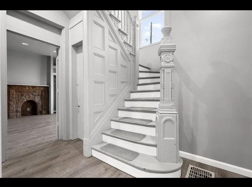
Painting woodwork grey is, next to just lighting it on fire,
the quickest way to destroy value in a historic home.
And on the good side, with the new box-style architecture we now have the answer to the post-covid questions: "How much can we make a house look like a mini-me version of the brutalist office building that we don't want to go to anymore?" "What would it be like to live in an industrial chicken coop?", "Will some people pay fortunes for literally any line of talk architecture schools can come up with?", and "As a human being, how comfortable are you around bodies with no faces?"
Postscript: It’s funny how as politics gets more extreme our colour palette gets more muted. Obviously grey is great and boxes are among our most useful shapes. It’s moderation, the pursuit of beauty, authenticity, and love that I’m missing here. After a couple days of talking about it and tossing it around I think, like all creative and artistic undertakings, it's about the intention or motivation more than the colour or the shape.

And let’s not even get started on the grey state of the automobile industry that seems to conform to Henry Ford’s disdain for colour from over 100 years ago, or Apple’s echo of Ford’s factory with their endlessly ‘space grey’ machines.